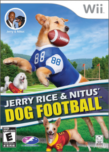
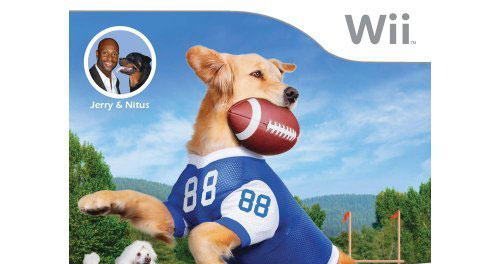
Like Jerry Rice & Nitus’ Dog Football (click to enlarge). Bad? I can’t help but consider the cover brilliant, in how perfectly conveys the absurdity of the game’s concept. They’ve even included a poodle and a chihuahua, so you know they aren’t being serious.
Instead, I want to focus on ten covers that are especially inept from a purely design standpoint. Which I hope will be equally entertaining.
But if it really was the doubleyew-tee-eff covers that you came here hoping to see, fear not! I have included a set of those as well, following the main entries.
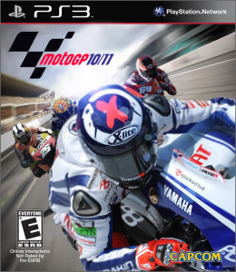
#10 MotoGP 10/11
The main cover image of Capcom’s MotoGP 10/11 is really good, actually—stylish, even. The problem is the amateurish logo they’ve slapped on it, which manages to cheapen the look of the entire cover.
What makes this particularly strange is that MotoGP has a previous logo that’s actually pretty good, which even appears on this cover shrunk down to the size of a postage stamp, right under the “M” of the main logo. What would happen if we tried using that logo instead…?
There we go. It’s not perfect, but doesn’t that look a lot better?
#9 Rabbids: Alive & Kicking
At first, the Rabbid in the forground with the foot appears to be a close-up of the Rabbid and kid at the bottom right. But wait, look at the two holes in the floor—they exist on the same plane! A giant, person-sized Rabbid just popped out of the floor! Lucky for the humans then that they have a giant of their own living with them.
I like the promo image of the Rabbid eating a Kinect so much better…
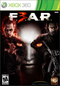
#8 F.E.A.R. 3
The official website lists the game as F.E.A.R. 3, but the title has been stylized on the cover as F.3.A.R., resulting in it being possibly the most frequently mocked title of the year (“fah-three-ar”).
But that’s not all, is it? It appears someone thought it’d be creative for the two main characters to each have an eye coming out of their armpit. It’s supposed to look like shadows under her eyes, but the shapes are too tall to look like realistic shadows that would exist on her face, resulting in the composition instead looking ridiculous and awkward.
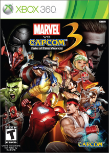
#7 Marvel Vs. Capcom 3: Fate Of Two Worlds
The cover image for Marvel Vs. Capcom 3 is a cluttered, chaotic mess. There is no flow, there is no hierarchy, there’s just a bunch of characters thrown into the composition seemingly at random, with two floating heads in the back that look like they were added as an afterthought. Compare this to just about any Marvel Vs. Capcom 3 image by brilliant Capcom and SNK artist Shinkiro.
To make matters worse, the logo has been designed in such a way that it’s pretty much impossible to make appear centered on an image, thanks to all the elements being centered except for a big “3” added to the side. As a designer, I hate being handed lopsided logos like this to design around.
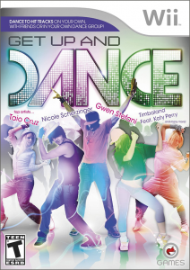
#6 Get Up And Dance
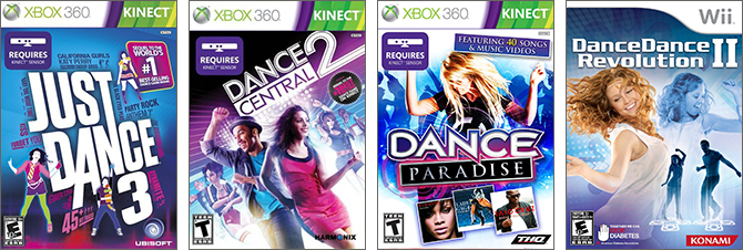
Typically, the trick to standing out and getting your game seen is to not just have a really well designed cover, but also a cover that looks like nothing else on the shelf. But apparently the goal when it comes to dance games is to look as much alike as possible, perhaps to try and trick consumers into thinking your game is just like that other game, because a certain look and style has developed for games of this genre.
Get Up And Dance looks like someone attempted the same style, and fell flat on their face.
Why the names at random diagonal angles? Why the random gradients that make the people look like flat cutouts? Just…why?
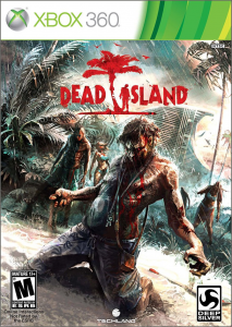
#5 Dead Island
The first time I saw the cover for Dead Island, I thought it was the ugliest cover I’d seen so far this year. But I couldn’t put my finger on why I hated it. Was it the unnecessary ’60s Batman-esque diagonal? Was it that the character looked like he was about to strike the iconic Platoon pose? Of course, not, that’d be silly.
Then I realized: other than black and a small bit of red, the image is painted entirely in shades of orange and blue (less saturated shades of orange appear tan). Boiling visuals down to only shades of orange and blue is currently a big trend in movies, which is becoming common enough in videogame box art that there’s now a blog devoted to the phenomenon, called Orange & Teal Games. Mind you, most of the examples given are more turquoise or azure than teal, but let’s not nitpick.
The reason orange and blue are such an overused combination is because it’s so effective. They’re complimentary colors, and also convey a sense of warm and cold. I disagree with people who feel that the combination is so overused that it should never be used anymore—sometimes it can be used quite well, such as in the case of Portal 2. The problem is when people take it a little too far, sucking all the color out of an image except for orange and blue. Which brings us back to Dead Island.
What impresses me about the cover to Dead Island is that they’ve taken two complimentary colors that are often used together because of the way they “pop,” and have managed to use those colors to flatten the image into brownish/grayish mud. From a color theory standpoint, you can’t even call this inept; pulling off such an extraordinary feat almost required a degree talent, like some strange form of anti-talent.
The Limited Edition cover is far superior.
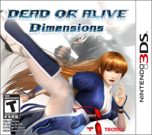
#4 Dead Or Alive: Dimensions
What’s this? I was looking for the official cover, not a fan art version posted to– wait, this is the official cover?
I just can’t get over that logo. Are they letting high schoolers design their box art now?
By the way, did you notice this one is all orange and blue as well?
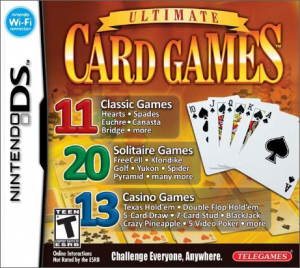
#3 Ultimate Card Games
It’s said a picture is worth a thousand words. Unfortunately, I don’t think the people responsible for this cover ever heard that bit of wisdom.
Anyone curious enough as to what card games are included would likely be willing to flip the box over and look, so why not put all that information on back and create a stronger visual for the front?
#2 Super Sonic Racer
No videogame box art this year has been victim of a worse Photoshop job than this one. It looks like someone felt that the main car didn’t “pop” enough, and felt the solution was covering the entire background with a screen of black.
But rather than adding depth as might have been the intention, it just makes it look like dark storm clouds have rolled in, casting all the background characters in darkness. Though it’s the hilariously sloppy job they did of painting in the black that makes the cover look particularly inept.
#1 5D’s Long Title
When you briefly glanced at the image above just now, did you catch the title? Take another look and read the title. Click to enlarge if you need to.
[pause]
Okay, you’re back? Did you notice how much effort it felt like it took to read that? A long title, in several different typestyles, sizes, and colors, with gradients added. If your very title is so cluttered that I don’t even want to read it, you’ve got a major design problem. And that is why Yu-Gi-Oh! 5D’s World Championship 2011: Over The Nexus (that’s right, the cover doesn’t even have “Yu-Gi-Oh!” and “5D’s” in the right order) is the #1 worst videogame box art of the year.
Also, notice that the phase that would be most likely to sell the game–”Yu-Gi-Oh!”–is the smallest text in the title.
And as if the cover wasn’t already busy enough with text, they’ve also added at the bottom that the game “Includes 3 Special Edition Trading Cards Inside!,” and then the same text in two more languages.
I was so distracted by all this text taking up nearly the entire cover that I didn’t even realize immediately that I was looking at an image of someone playing a card game on a motorcycle.
Honorable Mention: Surgery Simulator
“Hi I am doctor. Can I medical you?” There are a lot of Simulator games out there with truly atrocious covers, but this is possibly the worst one I’ve ever seen. It would’ve made the main list, except that it was a UK-only release.
Firstly, the guy looks like he’s only four feet tall, due to perspective issues. On top of that, his head gear is lit from the opposite side as his face is lit. And then there’s the clipboard. It looks like he’s standing in front of a table holding the clipboard while it rests up against his chest. I don’t even know what else to say.
Special Category: Sports

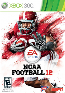
Typically, the trick to standing out and getting your game seen is to not just have a really well designed cover, but also a cover that looks like nothing else on the shelf. But I’ve said this already.
What’s strange is how publishers of multiple sports games will make a point to make all of their games look extra-similar to each other. Maybe they know something I don’t? Maybe making their games look similar actually does strengthen EA Sports or 2K Sports as a brand, rather than making everything look equally bland? Who knows.
Despite looking just like everything else, NCAA Football 12 sticks out to me for a few reasons. This year’s trend seems to be adding swirly textures to create a sense of movement, but in this particular case the color and texture looks more like he just stepped into the middle of a shooter. On top of that, there’s…wait, what is–

Whaaaaaaaaaaaat…
The Dog Football Awards
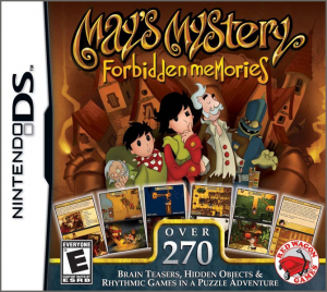
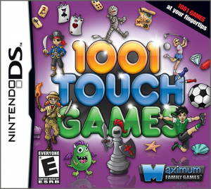
Alright, here it is, a group of the most bizarre covers of the year.
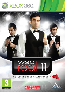

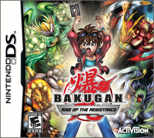
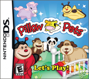
Next week: The Absolute Best Box Art Of 2011








December 24, 2011
Loved it!
December 24, 2011
You should do a list of the BEST covers this year, I’d like to hear them dissected from a design stand point.
December 24, 2011
great article 🙂