Welcome back to the only annual box art round-up that attempts to explain why each image is successful from a design perspective. They say you shouldn’t judge a book (or movie, or videogame) by its cover, but that doesn’t keep us from doing it anyways. Not everyone keeps up with the daily videogame news and reviews, and for them a striking or intriguing image is the quickest way to get them to check out the back of the box – or to click for more information. A good cover will at least get someone to look into whether a game is good or bad, while a bad cover can cause a lot of people to completely overlook a good game.
Here are ten covers that are both stylish and attention-getting.
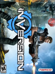
#10 Inversion

I see most box art online before the game’s release, but the first time I saw
Inversion was on the shelf, and it stopped me in my tracks. At first I thought they’d merely decided to be different by printing their cover landscape instead of portrait, but then I noticed the stop sign and did a double-take. I then made a note-to-self to look up the game later and see if it was any good (unfortunately, it’s not). The composition of this cover isn’t perfect, but any box art that makes me question whether my brain has broken is a success in my book.
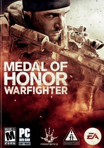
#9 Medal of Honor: Warfighter

Most videogame box art has the logo at the top, so that it’s easier for people to see the title if they’re flipping through a bunch of games in a rack. But when you see just a guy holding a rifle, I think you know what type of game this is going to be. Essentially, rifle-man
is the logo, and possibly a more effective one at this point than the name “Medal Of Honor.” The moody painterly look to the image is also a nice touch.
Medal Of Honor: Warfighter is an example of what shooter box art should be…if only the game itself had been any good. I have a feeling that poor selling games with good box art is resulting in a belief among major publishers that a game will only be successful if it has a bland design with single generic standing character centered on the cover. Like Bioshock Infinite.
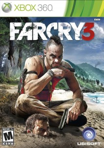
#8 Far Cry 3

Wait, is that a guy buried up to his nose in sand? That’s what helps make this such an intriguing cover. How did this guy get buried up to his nose, and who is this villainous looking guy sitting next to him? It helps that the composition is strong. The character’s head overlapping the title gives depth to the image, as well as helping to lead the guy from the title to his face, then down his arm to the gun, which is pointing your eye in the direction of the head in the sand. Well done.
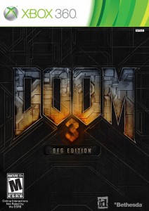
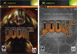
#7 Doom 3

This one might be considered cheating due to it being a rerelease of an older game with a cover that’s designed around a logo that was created in the ’90s. But its such a
strong logo. Every game wishes it had a logo this solid and timeless and perfect. The big improvement with this rerelease is the placement of the number “3.” That space between the two “O”s is the perfect place to put a number, and yet when the game was originally released, they put it on the side. Which isn’t a terrible idea in concept, but it did make the logo extremely difficult to look centered. On every promo image or cover where the original
Doom 3 logo appears, it looks annoyingly off-center. It might not bother you, but as a designer it drove me nuts.

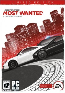
#6 Need For Speed: Most Wanted (2012)

Design collective MK12 has been heavily imitated since they were founded, but this cover image does it so well, I actually had to Google to check whether they did it or not. (They didn’t.) The limited color palette is striking, and designing on a diagonal is always good for a making a composition look dynamic. I also like the quirky way that diagonal sections have been cut out of the words “Most Wanted,” to match the italic angle of the Need For Speed logo.
#5 Fez

What makes the
Fez logo so great is that the geometric diagonal lettering is not only striking and dynamic, but also evokes the style of the game’s level design. The painted image by Bryan Lee O’Malley (creator of
Scott Pilgrim Vs. The World) perfectly conveys the idea of this being an old-school platformer, while hinting that there might be something more going on.
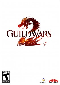
#4 Guild Wars 2

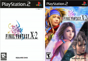
The covers of the
Final Fantasy series have a very distinctive look: a logo on a white background, with a small colorized logo illustration by Yoshitaka Amano. At least, that’s they look in most countries. In the US we’re afraid of white space, so we unceremoniously slap the logo on a Photoshopped promo image (see below).

The
Final Fantasy style of logo has been heavily imitated – particularly in Japan – but its rare for an imitator to do it as effectively. Which is what surprised me about the cover of
Guild Wars 2. Not only did they go for the logo on white cover of
Final Fantasy, but the idea of having the illustration serve as the “2” in the form of a dragon is just so perfect. It helps that the execution is brilliant as well, with a fantastic color scheme, and letter shapes that contrast nicely against the illustration. Yes, in the end it’s ultimately just a logo on a white background. But it’s such a strong logo, I put it ahead of
Doom 3.
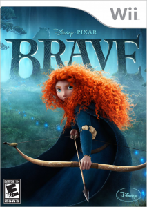
#3 Brave

This one might be considered cheating due to it just being a movie poster slapped on a videogame box. But then you have to ask yourself: why are movie posters so often more well-designed than videogame box art? There are bad movie posters too, of course, but on average, movie posters tend to be more adventurous and more interesting. On the other hand, DVD and Blu-ray releases frequently throw out the posters entirely for covers that sometimes look even less inspired than videogame box art, so
who knows what’s going on there.
Regardless, the Brave poster makes for a good cover image. Merida is in an exciting prepared-for-action pose rather than just standing straight with arms at her sides. The color scheme is mostly cool colors, with the only warm colors being her hair and face, her hands, and the bow and arrow, in order to put emphasis on them. I also particularly like how the logo has been integrated into the background like an actual physical object, similar the cover of id and Bethesda’s Rage.
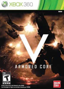
#2 Armored Core V

The most effective way to stand out when shelved with a bunch of games is to look at what everyone else is doing, and do the exact opposite. The logo treatment of
Armored Core V is so bold and daring, it immediately sticks out when surrounded by other games on a shelf. It doesn’t even matter that I can’t tell what’s going on in the background image; I previously knew almost nothing about the
Armored Core series, but this cover had me so intrigued that I went and read up on it. This cover wins at box art. Though if other games start taking the same approach, it will eventually become less effective.
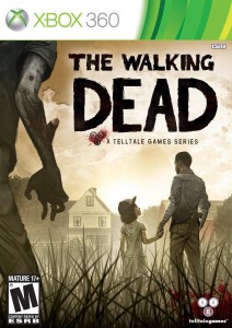
#1 The Walking Dead

The cover to Telltale’s
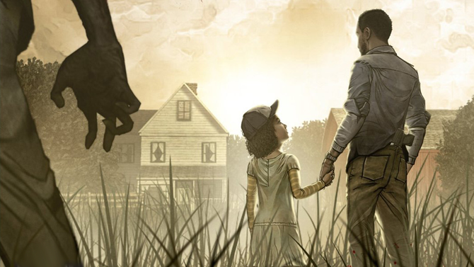
The Walking Dead also does something unique, but it’s a lot more subtle. What this cover does that no one else is doing is trying to tell a story in a single image. There’s a man and a girl holding hands. The man has a gun in the back of his pants, suggesting that they’re already in survival mode. They appear to be heading towards a house in the distance. The girl is looking up at him, as though she feels safe with him. It appears they haven’t yet noticed the zombie heading towards them.
On top of that, it’s a well-composed image. It’s “shot” at a low angle, which makes the image more dramatic. The zombie vertically stretches the entire height of the image (and more), which looks more dynamic than if his head was just below the logo. It also makes him appear to tower over the other two characters, symbolizing the imminent threat. And then the logo fits nicely into the remaining space in the sky. I think it would’ve added further visual depth and dynamicism if the logo had been taller, so that the man’s head overlapped it slightly, but that’s a minor thing.
Trying to tell a story in a single image is an extremely difficult thing to do, especially without words. People like Gary Larson (The Far Side) and Charles Addams (The Addams Family) were experts at this sort of thing, but its a skill few others have mastered. I’m not sure I’d necessarily say that The Walking Dead cover is on the same level as the work of those legends, but I consider it a successful image. I wish more covers would attempt this.
NEXT: The worst of 2012, the best alternate covers, and honorable mentions.
